Vita
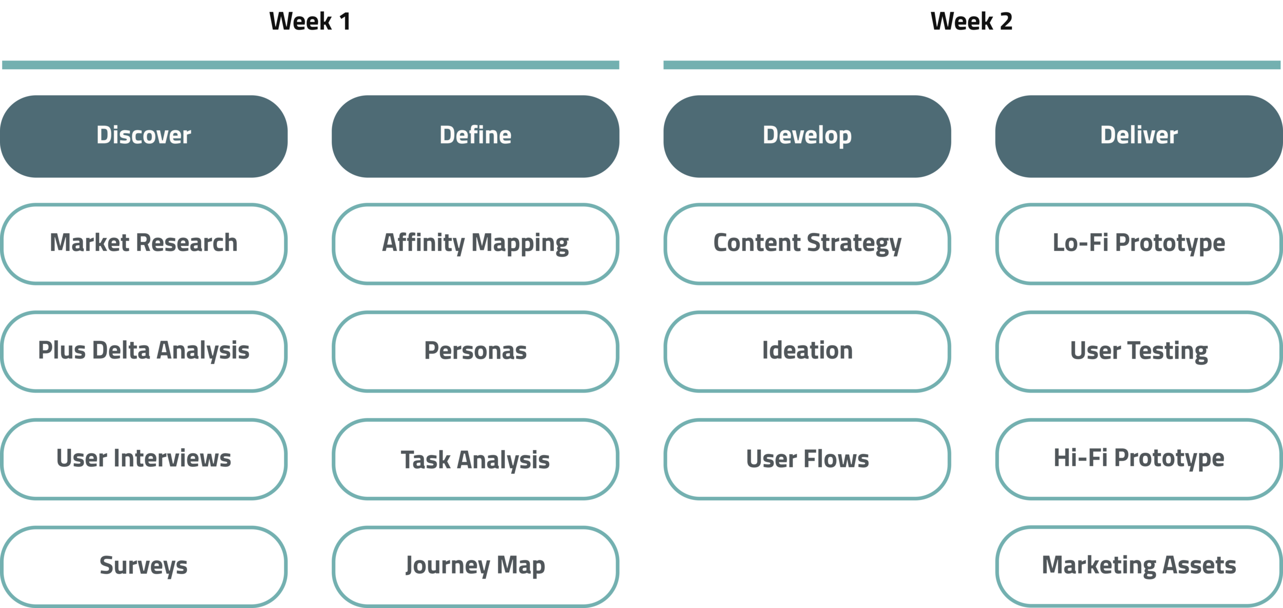
Duration
2 Weeks
Tools
Miro, InVision, Figma,
Photoshop, After Effects
My role
Project Manager: Responsible for conducting daily stand-ups and retrospectives, while ensuring the team adhered to various outcomes and deadlines detailed in the brief.
Research: I conducted interviews, explored the branding and secondary research, and synthesised insights.
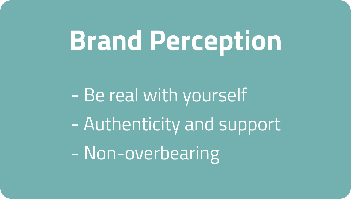
Design: I co-developed the content strategy and created the style guide and branding assets. I was responsible for the lo-fi wireframes and the hi-fi prototype design and interaction design. I also designed marketing collateral outcomes.
Timeline
Overview
Who the heck are Vita?
Vita is a not-for-profit organisation that empowers people to achieve healthier, fuller lives via sustainable lifestyle choices. Through preventative healthcare research and VicHealth funding, Vita has established an in-house program centred around chronic disease prevention.
Backed by research from the Australian Institue of Health and Welfare, the physical program's foundation focuses on getting people to eat better through plant-based nutrition. Vita firmly believes that by providing people with guidance towards better eating decisions, it will help them fulfil their potential of living a better life.
What's their problem?
Vita has identified chronic disease as Australia's number one killer, with around 70-90% of cases being preventable. As such, Vita wishes to act fast and scale its program to an audience of 100 million by 2023. To meet distribution needs, Vita needs to turn its service into a digital product that more people can access. They have identified the best way to reach their business goal is by taking what they already know about switching to a plant-based diet:
Our objective
- Explore habits and the behavioural science surrounding nutrition
- Pinpoint Vita's unique selling point and target audience through user interviews and market research
- Form a content strategy that accurately reflects Vita's values and resonates with the target audience
Solution summary
Our solution was a Vita app, masquerading as a database of healthy recipes, with the core objective to combat user decision fatigue*.
- Test the prototype here
- View the complete project pitch at this link
* Decision fatigue is the deterioration of our ability to make good decisions after a long session of decision making.
Offering users purpose by highlighting their motivations for eating healthy.
A database of healthy, diet and time specific meals to combat decision fatigue.
Promoting accountability via
a native planner to view
meals and shopping items.
Rewarding users with incentives
and gamifying their plant-based
eating through a points system.
Discover
Scoping out the market
Our market research alerted us to how saturated the health and nutrition industry was. The products all seemed similar, but beneath the hood, they focused on unique selling points. There were apps that revolved around tracking and logging of foods, but also apps that focused on holistic lifestyles and habits. We identified the latter category as our key competition, as Vita is focused on tackling chronic disease and leading a sustainable and healthy lifestyle.
Analysing the competition
The competitive analysis outlined where our primary competitors excelled and what their weaknesses were. We needed to validate which features were applicable in our user interviews, but also what Vita's capitalisation in the market would be. To define this, we identified the key focuses of other apps on the market and plotted them on an opportunity matrix to highlight a gap to be filled:
Putting assumptions to paper
Amidst our market research, we noted all our assumptions in Miro before diving into our user interviews.
We then affinity mapped these assumptions and categorised them in groups that would form the basis of our topic map. These topics would inform the user interview and survey questions:
- Convenience
- Excuses
- Motivations
- Ideologies on health
- Behaviours and past experiences
3, 2, 1...Let the user research begin!
27
User interviews conducted
accross two rounds
3
Interview subjects -
users, experts & converts
2
Surveys used, at the start and
end to validate our research
Our goal through the user interviews was to gather information relating to our pre-defined topic map questions. We interviewed three groups of people - users, subject-matter experts (doctors, psychologists, dieticians and influencers) and converts (people who'd successfully sustained a transition to a healthier lifestyle).
Our first survey informed our interview questions at the beginning of the process, and the second was a quantitative survey used to validate our interview insights at the end. We held ourselves accountable to another round of six user interviews, as the team identified the need for more user subjects in our sample group. This second pool of candidates was an integral piece in building our future archetypes and personas.
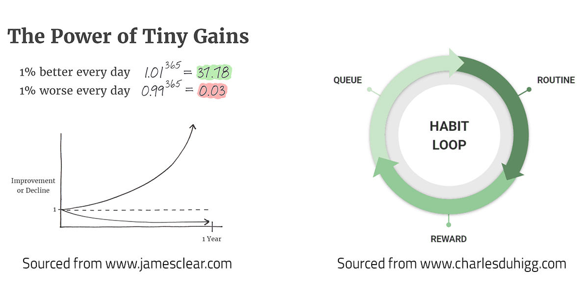
Geeking out on habitual science theory
To support our expert interviews, our team sourced focused research on the behavioural science behind habits. Our assumptions identified habit as a key cog in people's approach towards nutrition, so we looked to experts James Clear and Charles Duhigg to distil their findings. The key theories applied were:
Define
Making sense of our research insights
To solidify our research, we synthesised insights through affinity mapping. We created separate affinity maps for our users and experts as we asked targeted questions to extract different sets of information from both parties.
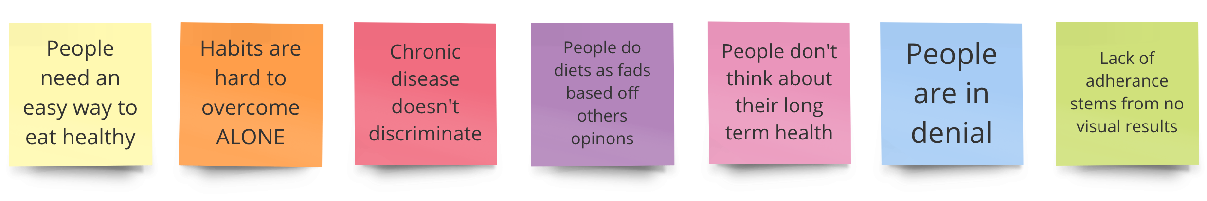
What we discovered about Vita's userbase
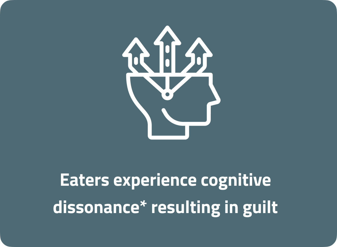
* The state of having inconsistent thoughts, beliefs, or attitudes, especially as relating to behavioural decisions and attitude change.
The experts told us...
Who are we targeting?
Once our key insights were defined, we constructed an empathy map to categorise insights into think, feel, say and do categories. The process unfurled alarmingly fast - so quick, in fact, that our researcher Sayoa intervened stating something wasn't quite right. Her intuition was correct...our initial persona was too superficial and wasn't digging deep enough towards the essence of the users' problems.
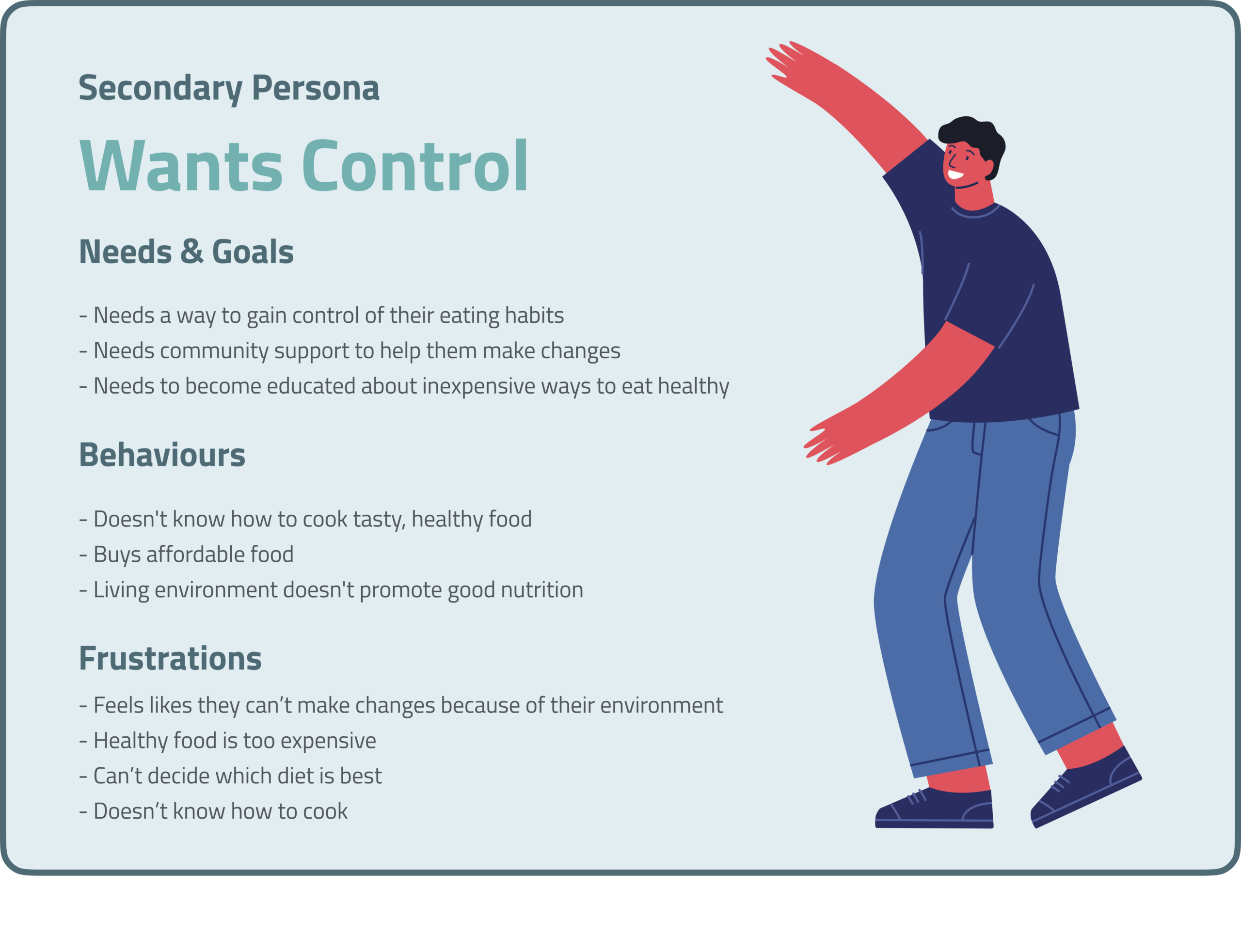
This sparked a pivot, causing us to revisit the interviews and grab six additional users to form our second round of user interviews. The insights carried more weight and helped form three distinct personas. Meet our primary, Frankie.
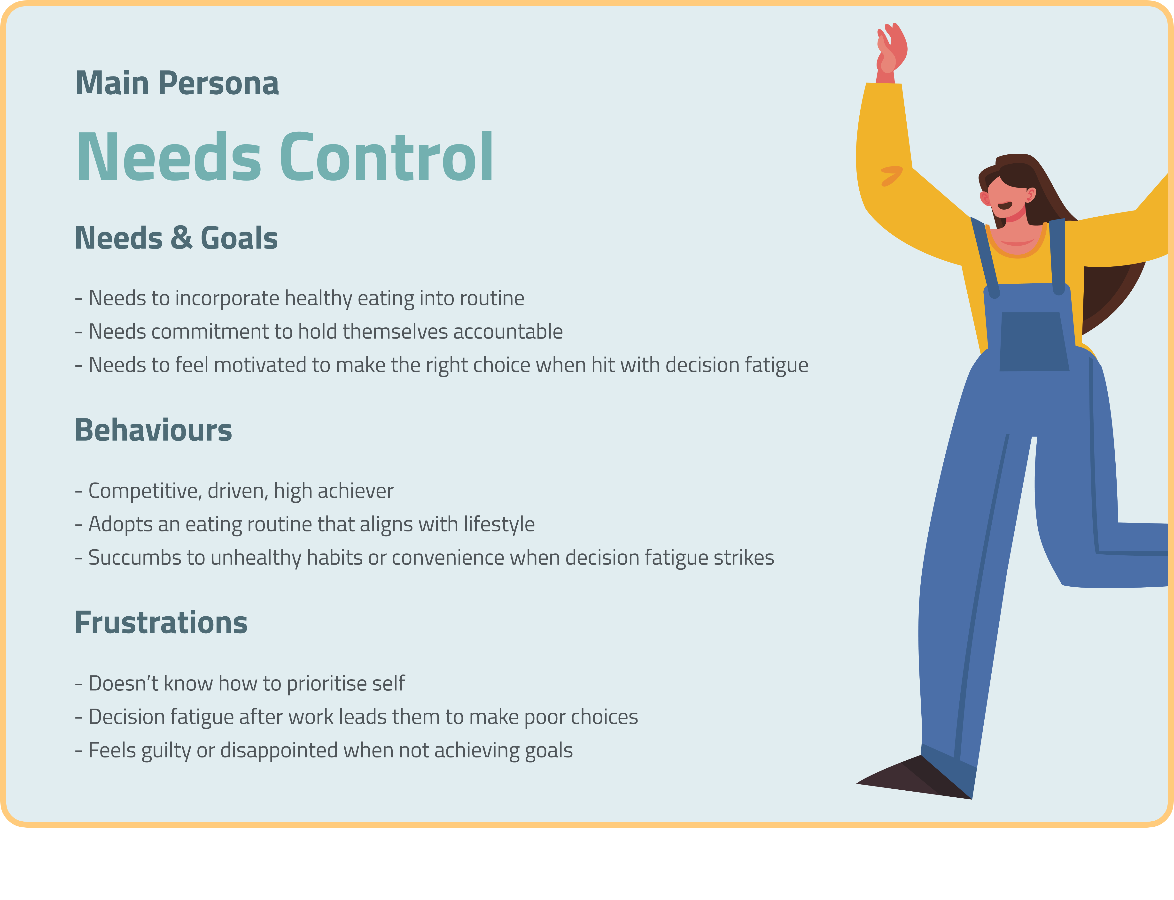

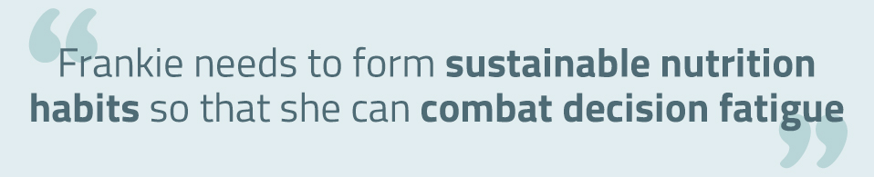
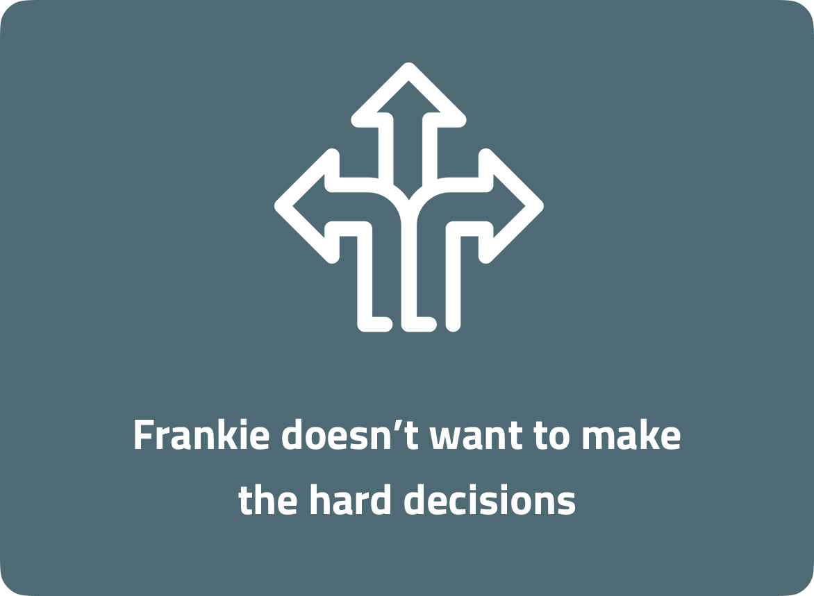
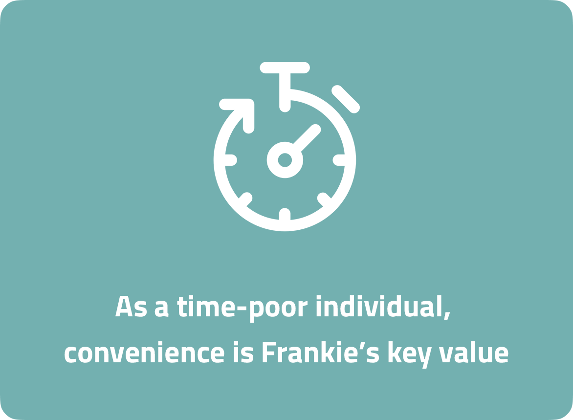
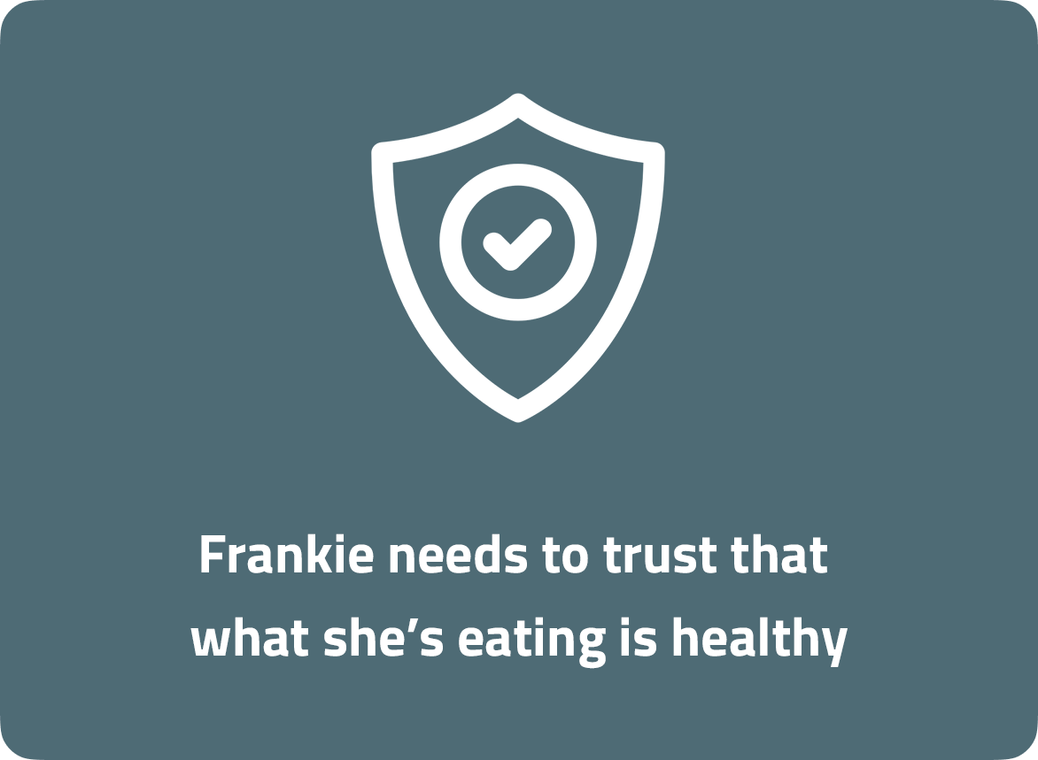
So what's Frankie's problem then?
Okay, so how might we...
- Help Frankie combat decision fatigue?
- Motivate Frankie to achieve the desired nutrition outcome(s)?
- Provide feedback and support?
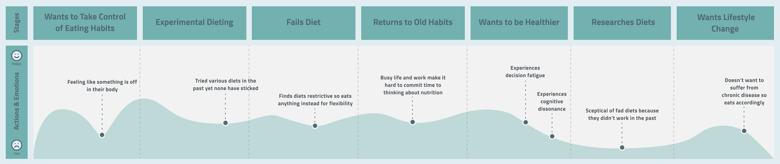
Mapping Frankie's emotional journey
To further flesh-out the areas which we could address with our solution, the team utilised a journey map to outline the touchpoints and emotions experienced within a typical user scenario - highlighting diet research as a major slump.
Develop
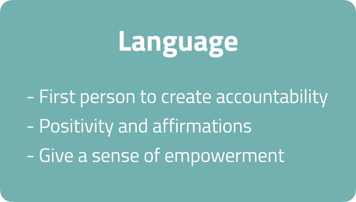
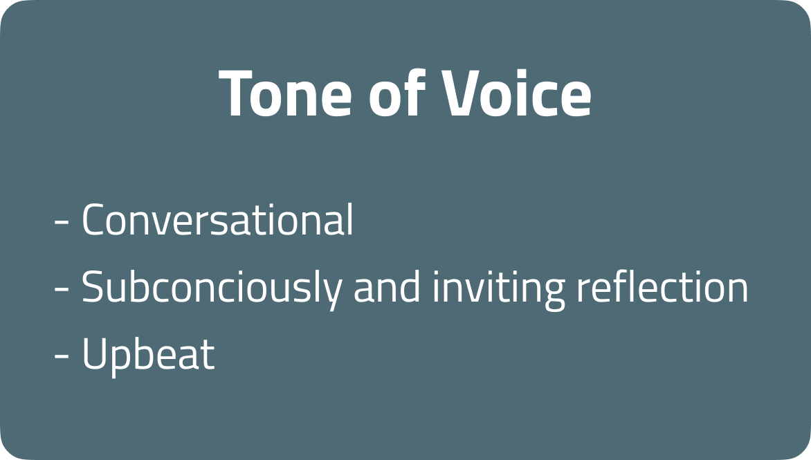
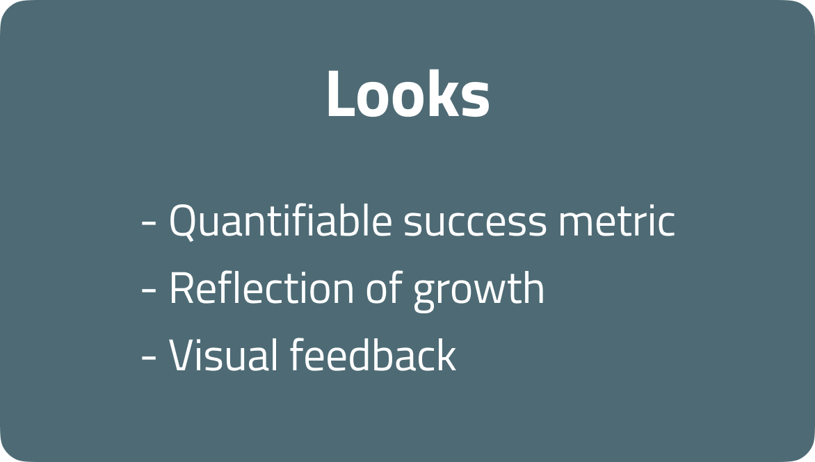
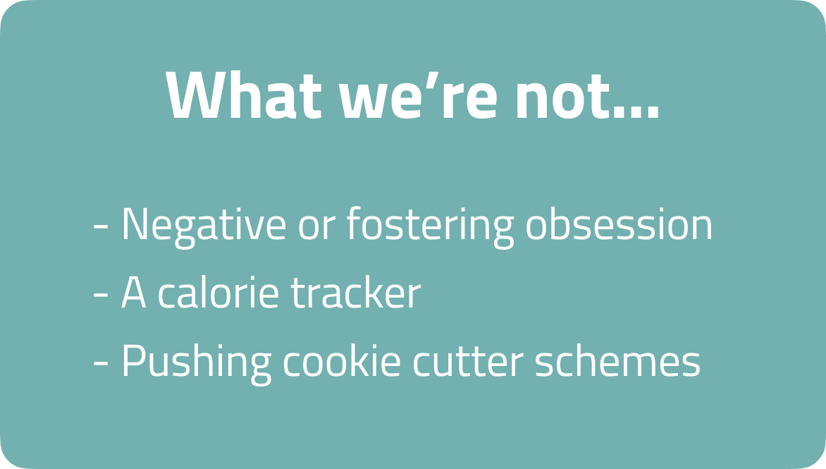
Making good content great
Once our problem and how might we statements were defined, we began developing an app solution to create value for people like Frankie. With newfound user insights and a defined persona, we could revisit the brand values and begin our content strategy. This enabled us to align Vita's goals with our user, in addition to differentiating ourselves from our competition with a stronger sense of identity. This framework served as a north star for the rest of the project.
Setting ideas free
Our design studio consisted of several rounds of Crazy 8's that sparked discussion and sent idea generation into overdrive. At the forefront of our design studio was our how might we statements, with our primary goal to address Frankie's frustrations to form a hypothesis statement. We spitballed a few ideas:
- How can we quantify Frankie's results and progress and what are we actually tracking?
- How do we promote and educate a plant-based diet without forcing it down the user's throat?
- How could we offer education, motivation and support?
Hypothesis statement
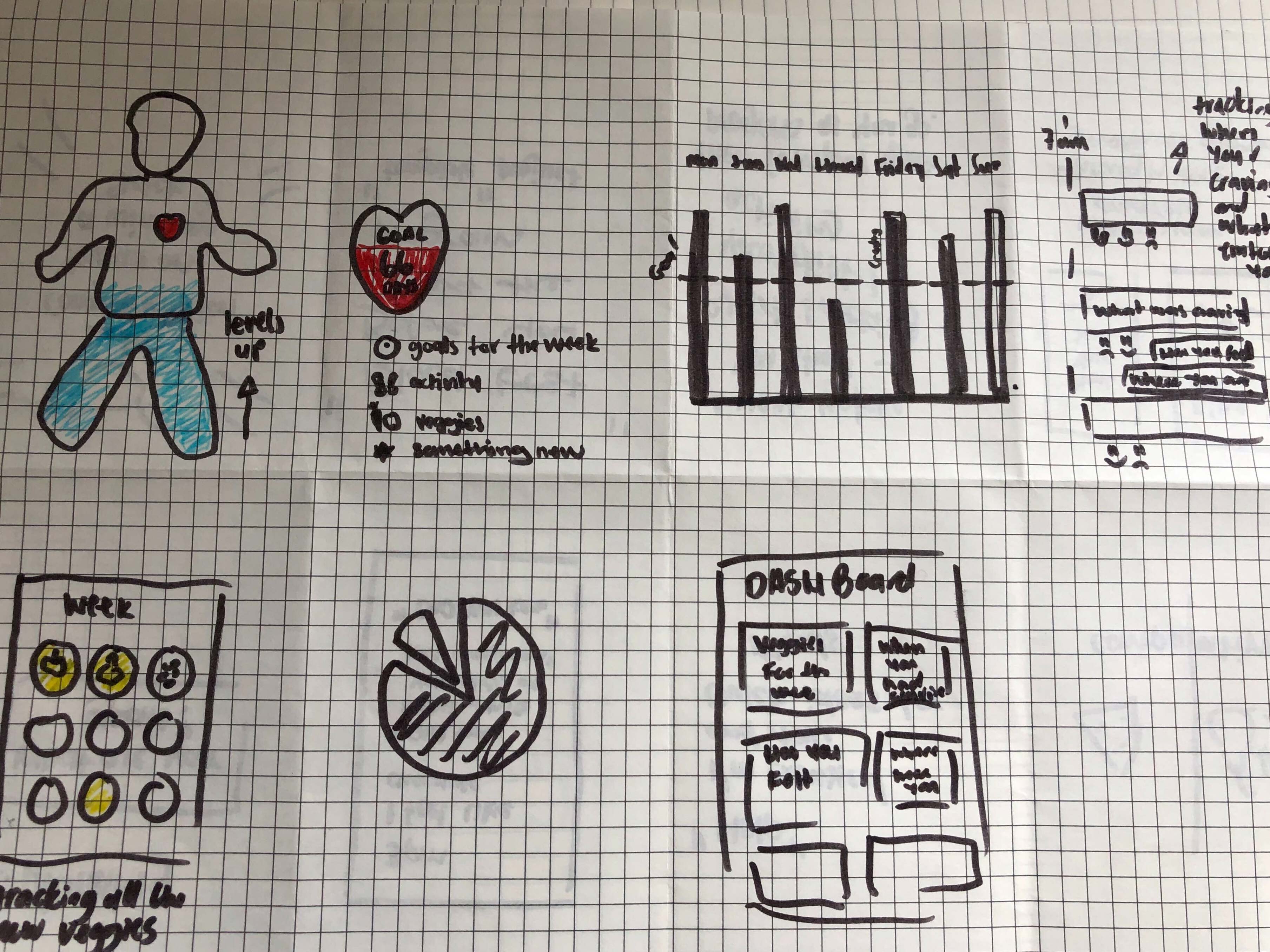
Lo-fi wireframes
Due to remote circumstances, we collaboratively sketched wireframes using InVision. Our initial screens revolved around mindful eating, in addition to pinpointing and tracking bad habit cues.
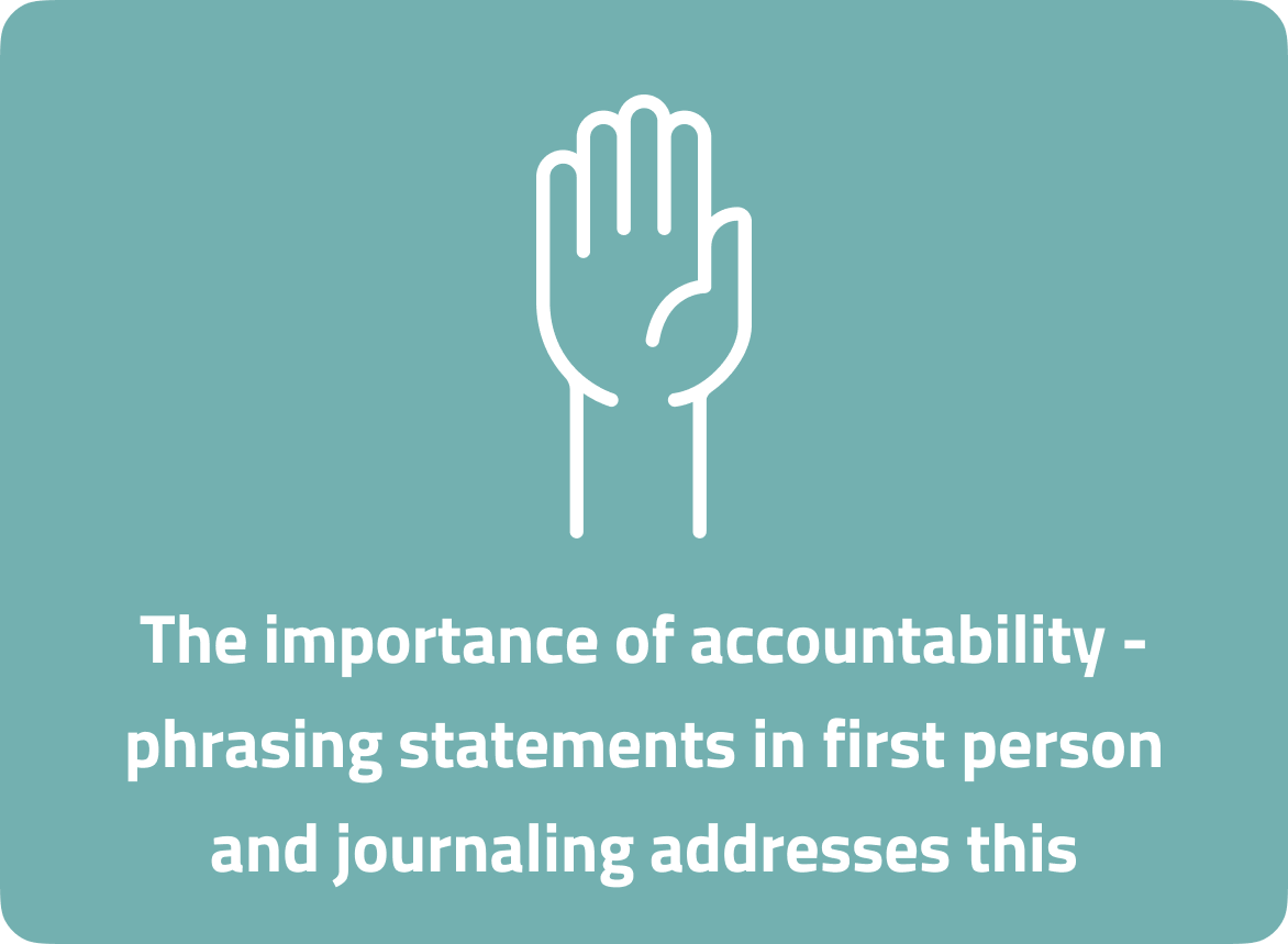
Our lo-fi prototype attempted to guide users towards accountability and awareness of cues that trigger poor dietary choices. The underlying goal was to give them a solution to sustainable habit formation. This was achieved by quantifying healthy choices by visualising the emotions surrounding each meal. Push notifications would hold users accountable by monitoring emotions and the app would encourage journaling each night to reinforce their core motivations.
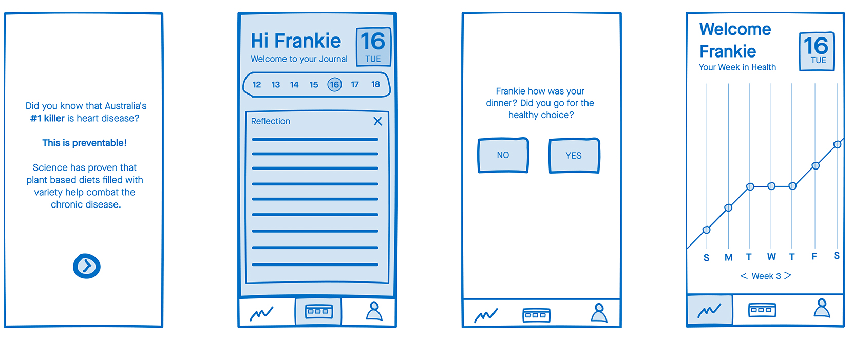
Killing our darling...
Conducting our usability test highlighted that something was critically wrong. Key insights were:
- Nobody knew where they were meant to source meals from
- Notifications were perceived as annoying
- The graph was seen as demotivating
- Testers didn’t understand the journal concept
It was clear we'd skewed from what Frankie actually needed and were focused on habit identification rather than combating decision fatigue. One quote that resonated with our team from a user test was:
"If I felt really stressed after a day at work and got a notification asking how I was feeling and telling me what I was eating…I’d think f*ck no I’m not, I’m ordering a pizza.”
Deliver
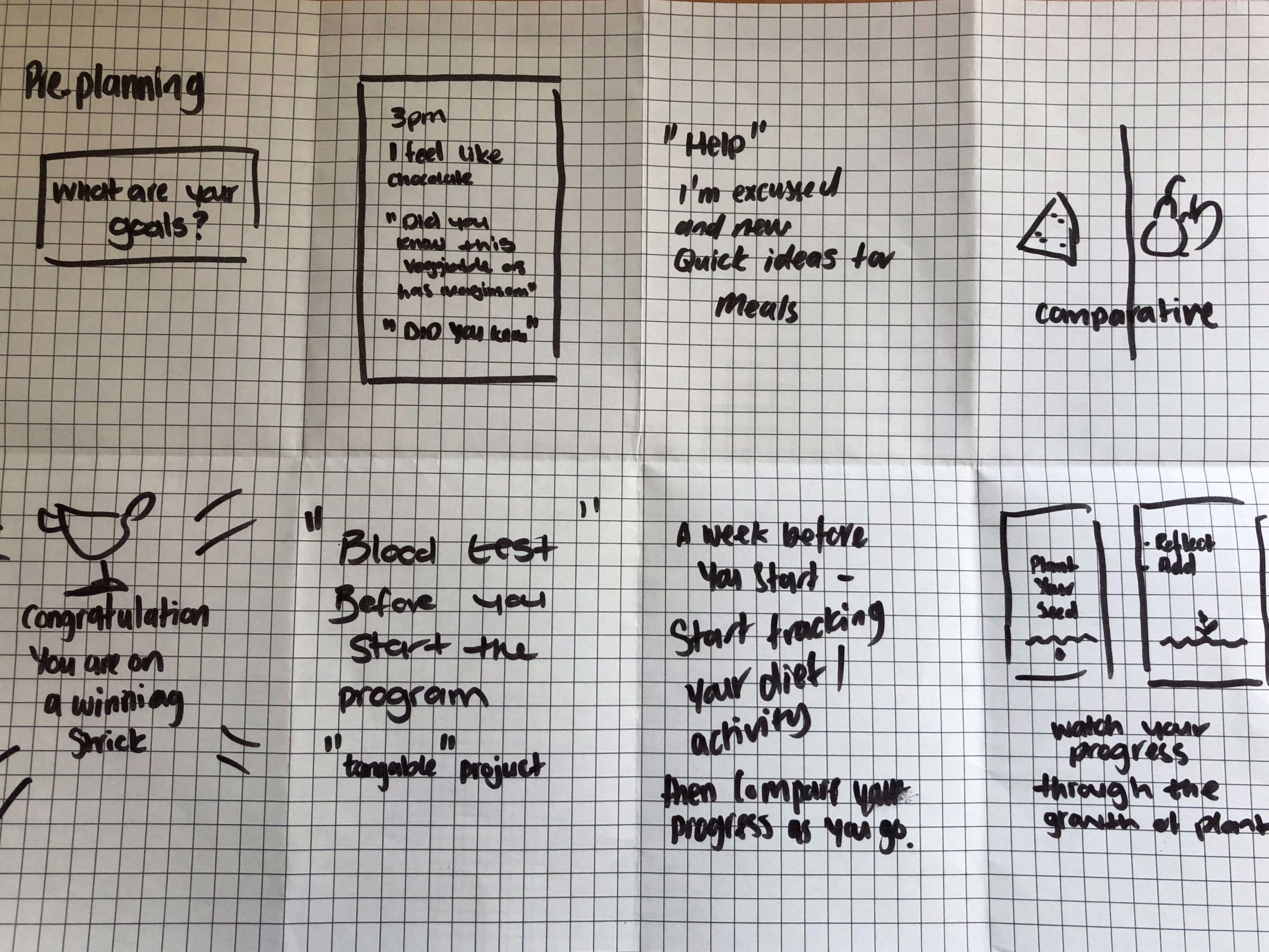
The major pivot
From the lo-fi usability test results, we understood that the initial prototype had missed the mark. So we dived back into our problem statement and reviewed Frankie's primary needs. We then rejigged our user flows around the below framework:
Creating a method to the madness
Formulating an atomic style-guide for collaboration was critical to consistency across our app and collateral. We opted for elements that'd promote an accessible, friendly vibe and could align with our content strategy. We achieved this through rounded contours, playful graphics, enticing interactions and soft greens that are often associated with growth.
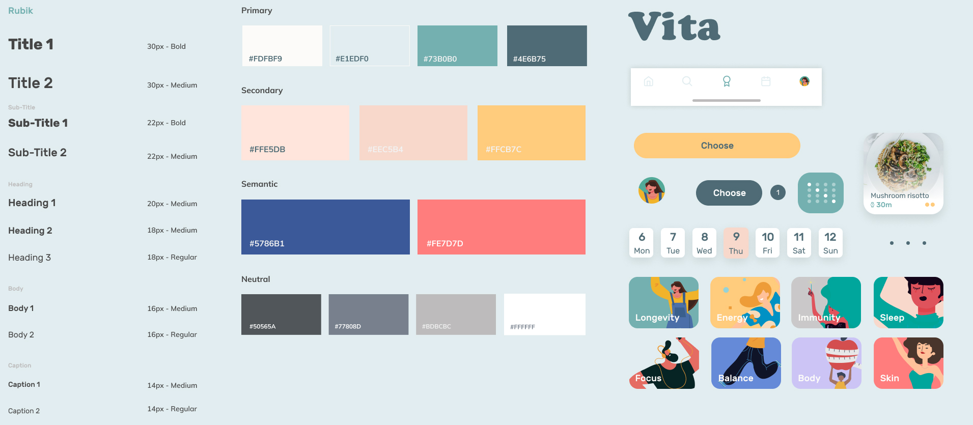
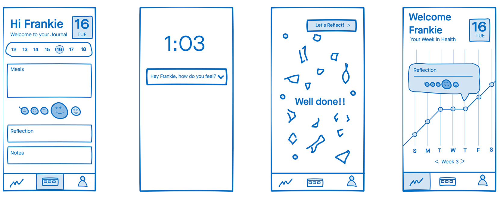
Our hi-fi solution
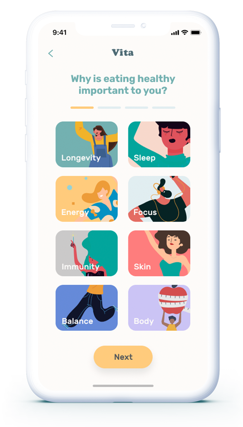
It all begins with onboarding
Insights show users need to know exactly what an app does and how it'll benefit them. Through an interactive onboarding process, we provoke deeper thought behind user motivations to eat healthier and capture their attention.
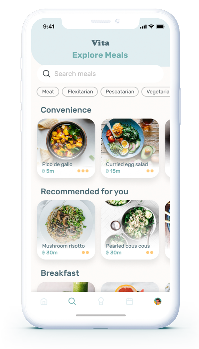
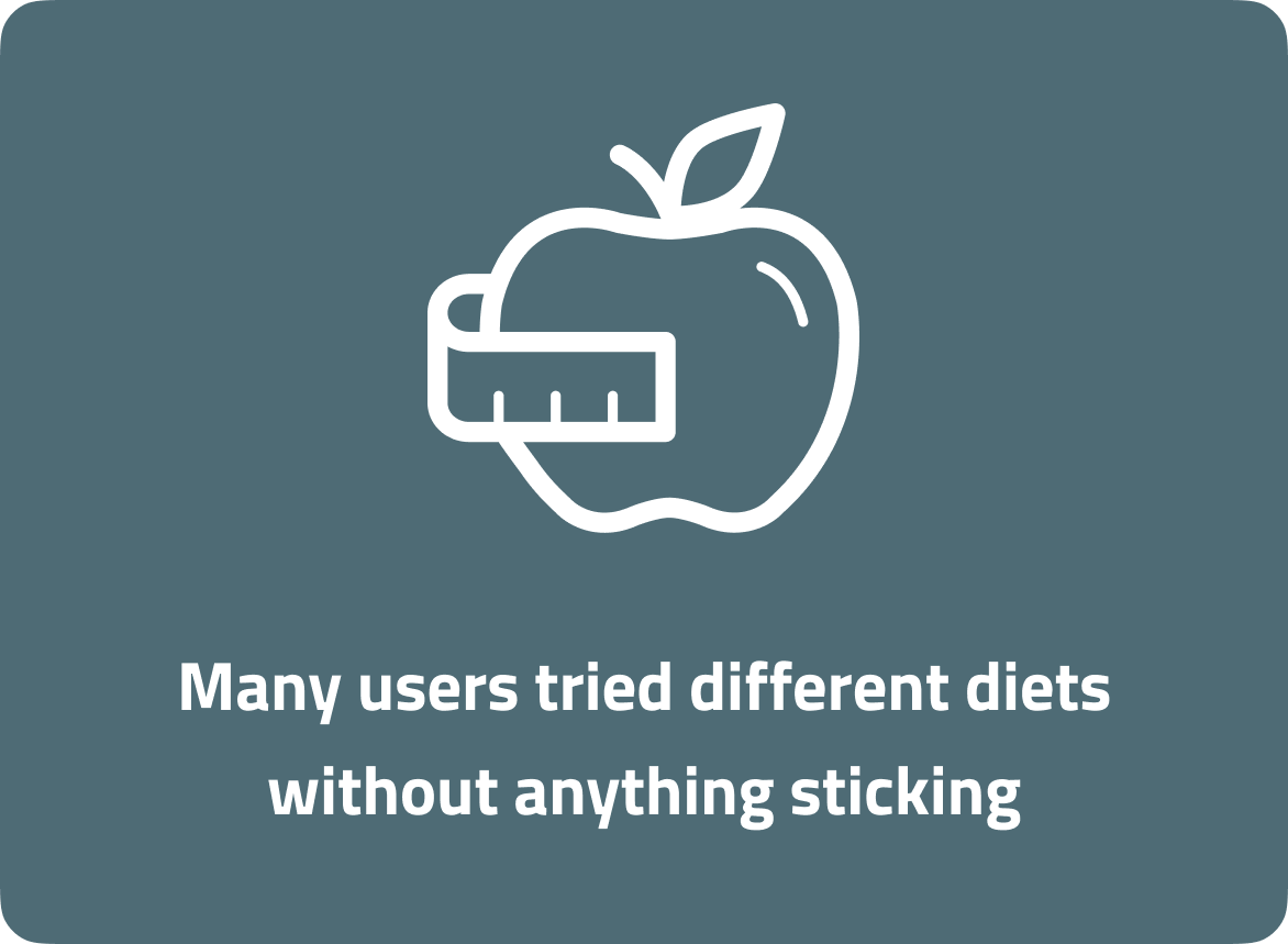
Freedom of choice
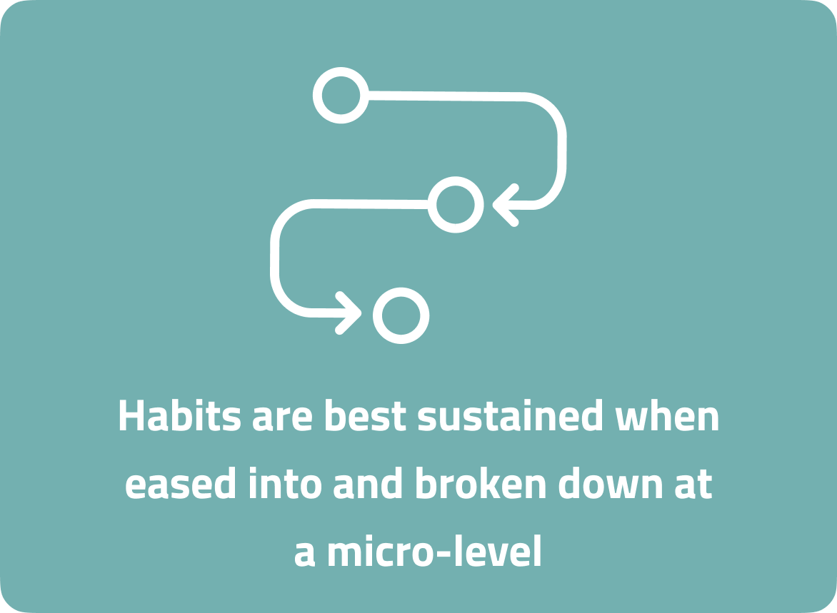
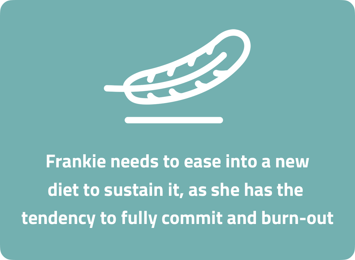
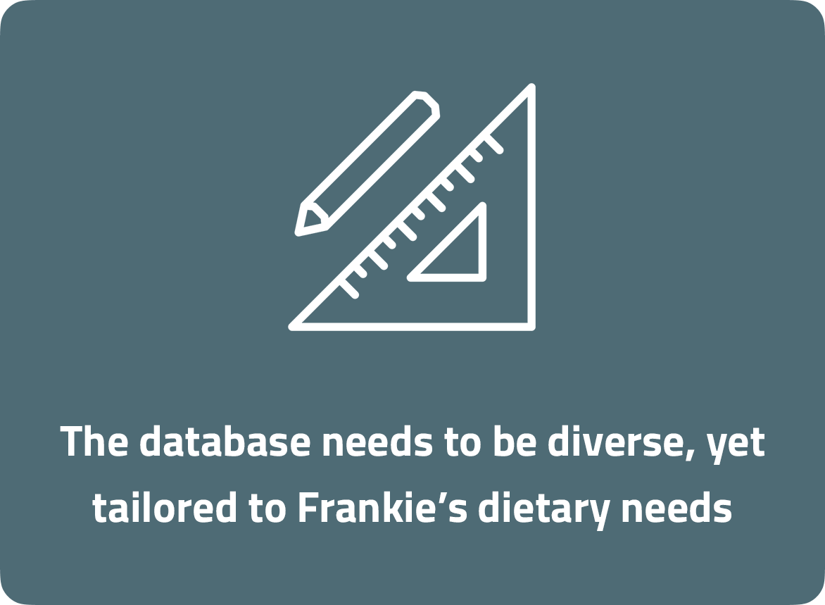
Users don't want to invest energy researching a meal - especially with all the contradicting information out there. We've provided a database of meals that will gradually ease users towards a vegetarian diet, at their own pace.
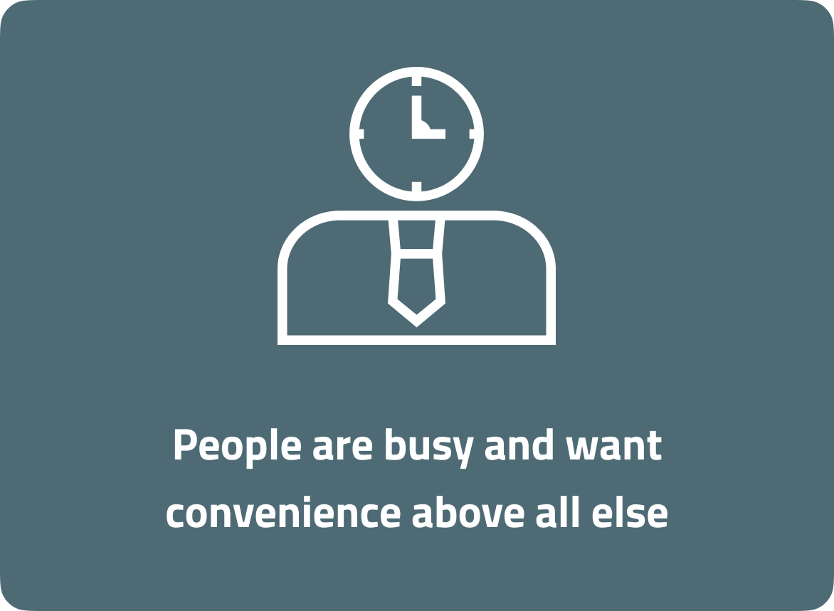
The power of routine
We don't need to convince our target audience about the power of routine. Creating a native planner and shopping list keeps users operating in the one app and organised.
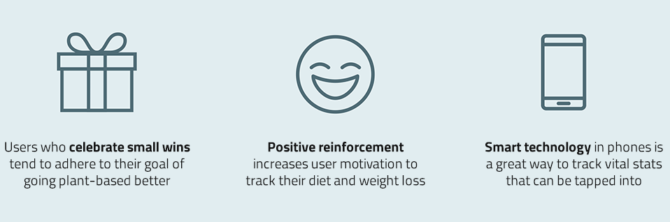
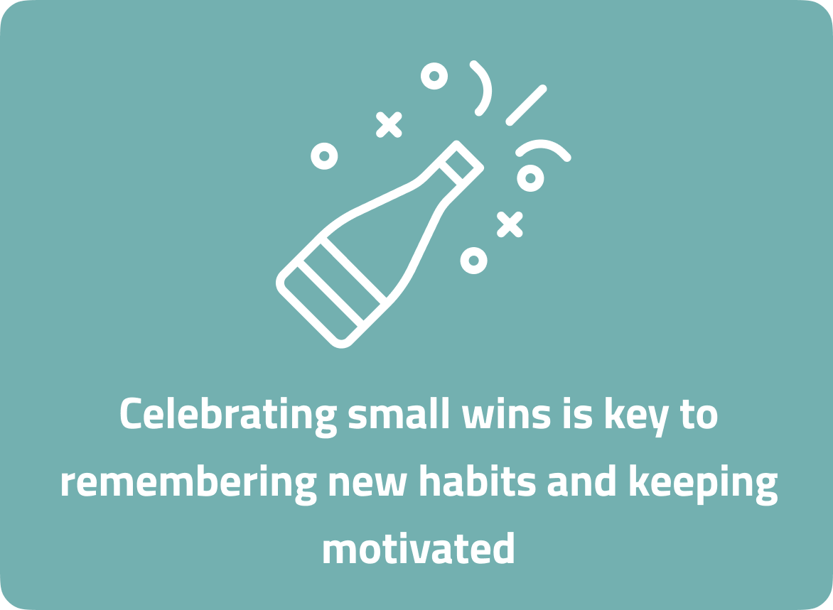
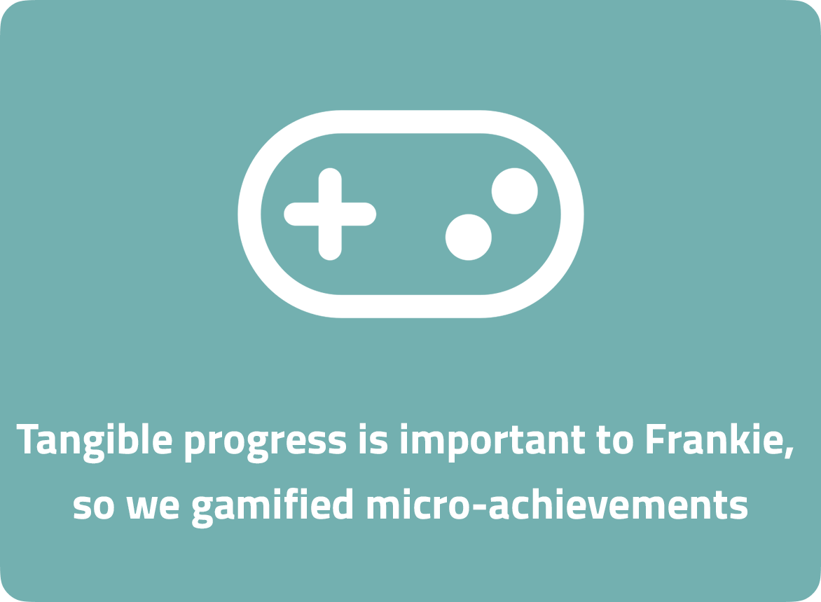
Celebrating the small wins
Experts told us the power of celebrating small goals, so we implemented this in the form of a gamified rewards system. Users can unlock badges via Vita points - which is the currency defining progress towards a plant-based diet.
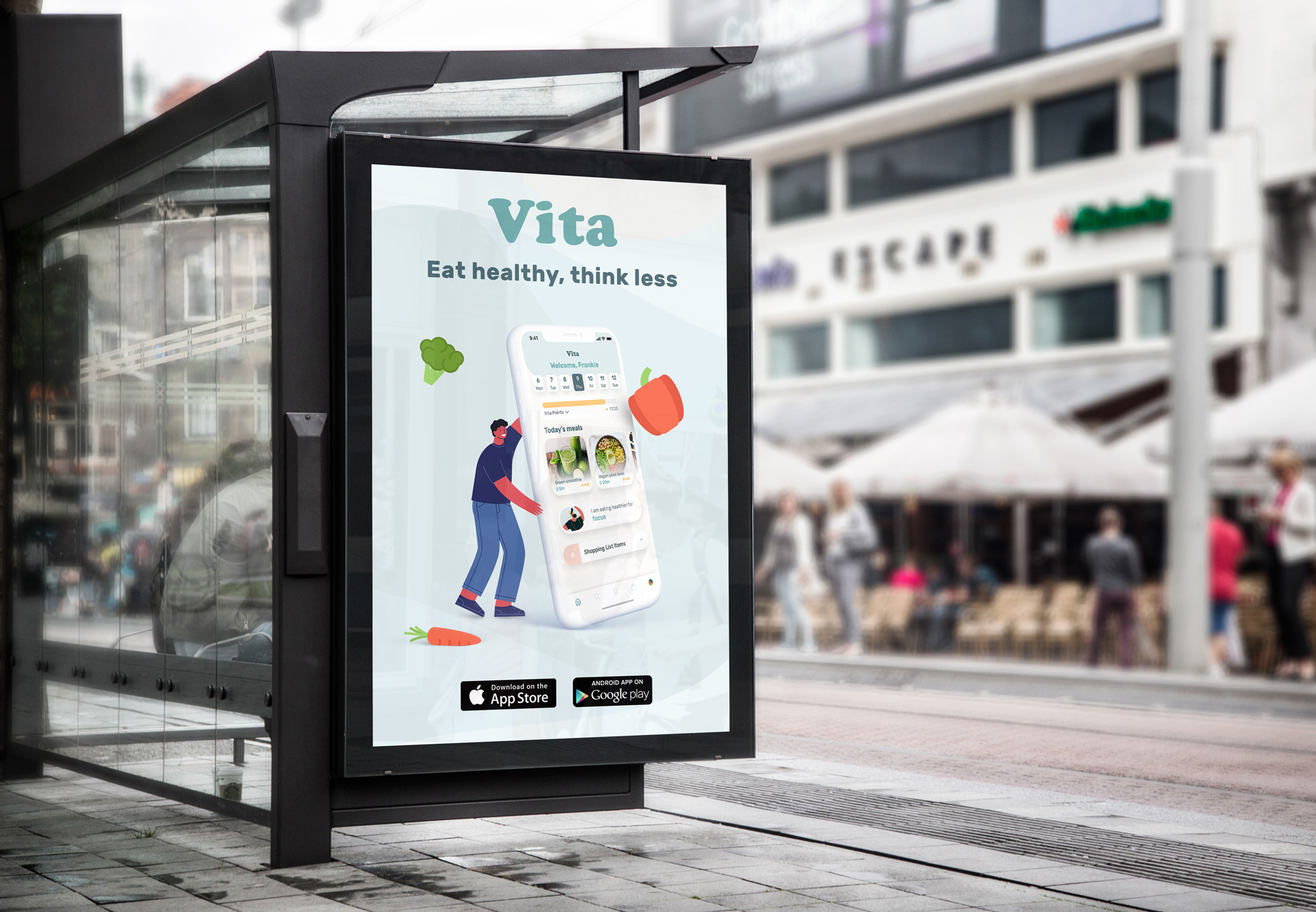
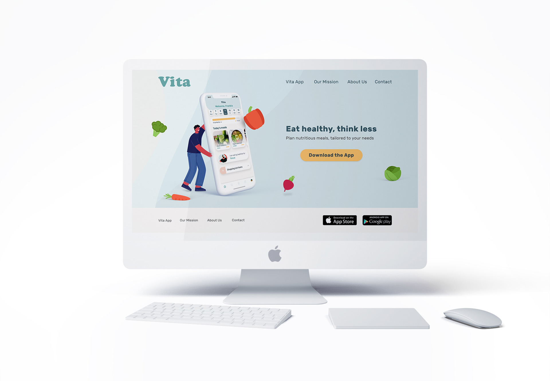
Try it out for yourself!
Eat healthy, think less
Our expert interviews informed us of the importance of marketing in the nutrition space. As one of our interviewees said,
"You could have the best product in the world, but if your marketing is non-existent, nobody will ever know about it."
As a result, we supplemented our app with a website designed for exploration of additional recipes and street signage calling people to download Vita. We captured the essence of the service through our slogan, "Eat healthy, think less."
Test results
We tested the app amongst five users who we thought fit the bill of the Frankie persona. Here were our findings:
- Users generally eat the same breakfast and similar lunches, so this app would bring the most value at dinner
- It was unclear how the shopping list was populated
- Users found the reward system fun but would like more clarification surrounding the Vita points
"That’s fantastic, even though it’s just for fun a little gamification is great even for someone as sceptical as me!"
Conclusion
Trials and tribulation
Hindsight is a beautiful thing. Our team functioned exceptionally well, however, we fell short in certain aspects:
- We hurried empathy mapping. As a result, we almost committed to a surface level persona
- Skipping the medium-fidelity due to time constraints resulted in our hi-fi being a gamble of assumptions
- Too much time was spent diving into market research and habit studies, that it blinded our primary goal
Personal takeaways
The design prompt and overall brief enabled me to see nutrition through a different lens. A person's relationship with food is such a personal thing and intrinsic roots that society often ingrains play a huge influence on what we eat. I'm much more conscious of why I gravitate towards certain foods and the deeper motivations of why people eat a certain way.
A shout-out
As a person who prefers being on the tools rather than directing, my team offered incredible support towards my approach to project management. Our team really rallied together when it mattered given the intense nature of the sprint, and we gave our unique skillsets enough room to flourish.
- Sayoa Jodar (UX) - A research weapon and incredible communicator
- Michele Mason (UX/UI) - An all-round creative superstar with management flair
- Jason Nguyen (UX) - A talented young-gun with a knack for market research